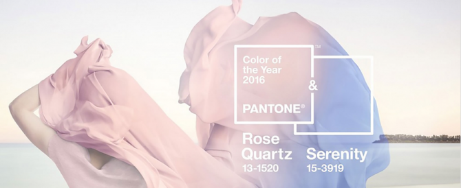
 The color experts over at Pantone released their annual choice for the hue that will dominate in the upcoming year, but for the first time ever, they picked two tones: Serenity and Rose Quartz.
Both are a soft pastel and evoke colors one might see at a gender reveal party. Ironically, the choice of the colors was made to coincide with gender fluidity within the fashion realm.
“In many parts of the world we are experiencing a gender blur as it relates to fashion, which has in turn impacted color trends throughout all other areas of design,” Leatrice Eiseman, executive director of the Pantone Color Institute, said in a press release.
“This more unilateral approach to color is coinciding with societal movements toward gender equality and fluidity, the consumers’ increased comfort with using color as a form of expression which includes a generation that has less concern about being typecast or judged, and an open exchange of digital information that has opened our eyes to different approaches to color usage.”

